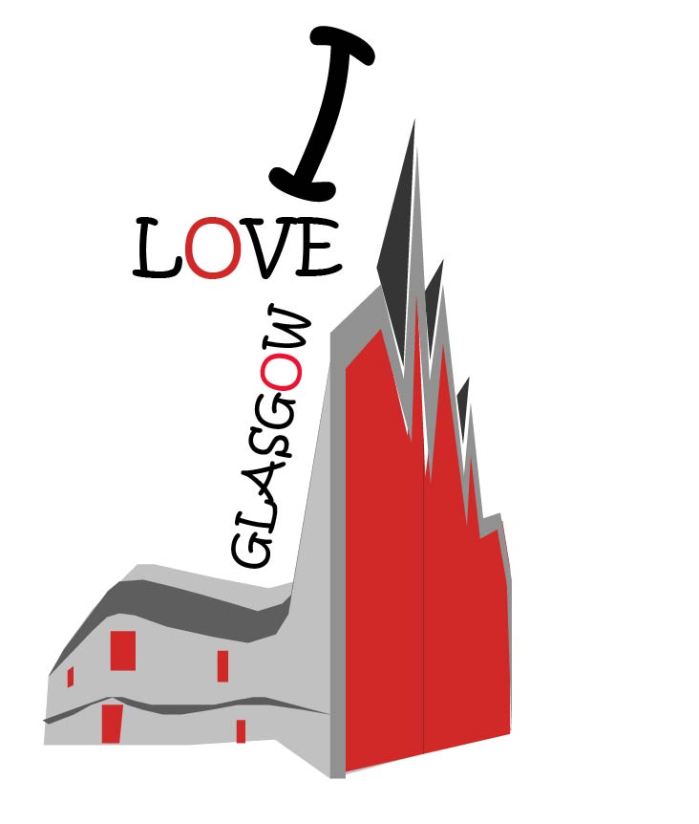
Illustrator Image

The image that i created was based on The Riverside Museum. The picture was taken on one of my many visits to the museum in which i attend frequently. I tend to go here when it’s a nice day then take a walk by the Riverside.

To create this image i used the pen tool which helped to cut shapes from the upper building and help to create the jaggered effect. I used black, red and grey as they stand out more amongst the white background.


glasgow design

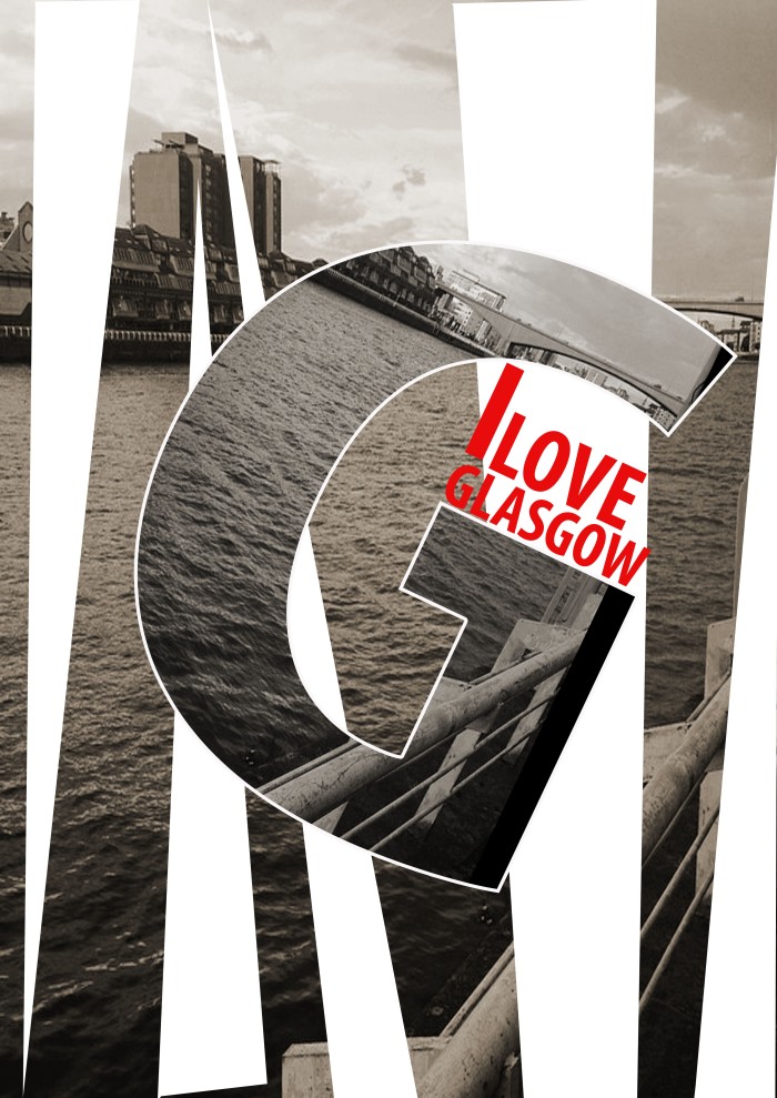
Photoshop Image

The image that i created was based in Glasgow City Centre. This picture was taken overlooking the water at the clyde side one of my favourite places to visit in a relaxing and tranquil atmosphere.

To create this image i used the polygon lasso tool which created the white cutting shapes throughout the image. I used black, red and white which made this image stand out with it’s attractive background.

Poster Design - BitMap Final - Lara

Silodesign

SILO DESIGN – Silo are specialists in experimental furniture and interiors with exceptional craftsmanship and functionality.

Their practice prides itself on a very open and responsive discourse with clients.

They cover all aspects of a project from concept to install.

Experienced in commercial domestic and retail interiors with a fun, abstract and utilitarian fee

This Silo Design uses mostly grey colours to emphasise the theme. A lot of words are used within the designs to help promote postivity, happiness and dedication to life.

Holland-dance-festival 04

I like this image as the two colours pink and blue contrast well which helps it to stand out. The circles are a good shape to use within the pink background.

Hiromura Masaaki

I also have chosen this one as a favourite from the collection of designs. This shows an escalator with large print which is used by many commutors.

peter jpeg

PETER SAVILLE – Peter Saville (born 9 October 1955) is an English art director  and graphic designer. He came to fame for the many record sleeves he designed for Factory Records, of which he was a director

Peter Saville uses bold colours to emphasise his pieces of art. There is a mixture within there images of patterns, bright colours and flowers.

Savilles Colour Code  –Combining many of my concepts and design style ideas.:

This is one of my favourite images used as it shows many colours within a circle which helps us to use our imagination. It gives off an older feel maybe from the 60s which was a very colourful era.

Power, Corruption & Lies, New Order (Factory, 1983). “The title seemed Machiavellian. So I went to the National Gallery looking for a Renaissance portrait of a dark prince. In the end, it was too obvious and I gave up for the day and bought some postcards from the shop. I was with my girlfriend at the time, who saw me holding a postcard of the Fantin-Latour painting of flowers and said, ‘You are not thinking of that for the cover?’ It was a wonderful idea."

Another image I have chosen shows a bunch of flowers in quite a dull background. It helps the flowers stand out a little more but the image has more pale colours than bright.


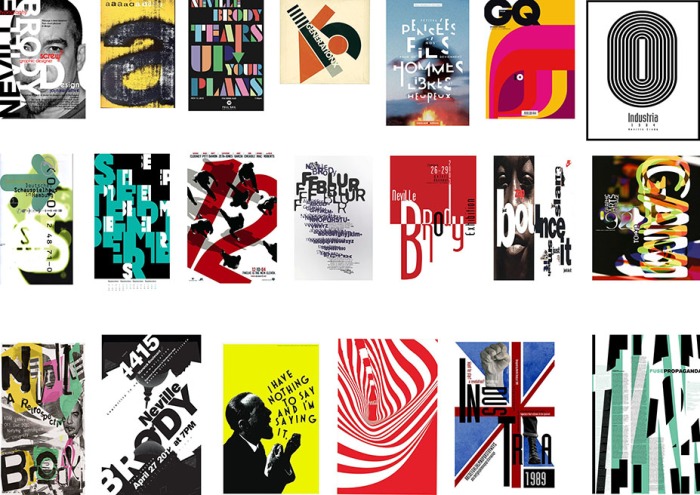
Neville Brody

NEVILLE BRODY – Neville Brody (born 23 April 1957) is an English graphic designer, typographer amd art director.

Research Studios has evolved to it’s new name Brody Associates.

Enhancing our offer to both current and prospective clients by focusing on our core strengths in digital, type and identity; streamlining our network hubs; and taking advantage of our wider associate family of leading experts in their respective creative and strategic disciplines.

Neville Brody has used many bright colours within his artwork which shows his inviduality. Every image is different and screams individuality.

Neville Brody, GQ Italia, Neville Brody at TYPO Berlin <a href="http://www.typoberlin.de/video/index.php?node_id=76_id=1_value=Neville%20Brody" rel="nofollow" target="_blank">www.typoberlin.de...</a>

This image shows bright colours which are pink, red, yellow and purple. The heading is in bold black print to empahsise the title. I like this image as it’s bright and when i look at it i see something quite childish and playful.

Neville Brody, coca cola design, a design advertising coca cola in where he has used the outline and shape of the coca cola bottle to make an almost optical illusion/psychedelic  pattern, i like this piece because it is eye catching and simple without losing what the advertisement is about and can clearly be recognised as the coca cola brand.

This is one of my favourite drinks so therefore is one of my favourite images. The colours white and red contrast well together and the swiveled shapes help your imagination run wild.


Graphical House

GRAPHICAL HOUSE – Graphical House is a Design Consultancy based in Glasgow. They create innovative, award-winning work in awide range of media and through a variety of disciplines.

The values are simple: design is a dialogue between client, 
designer and audience, and it must be engaging, different 
and memorable to be effective.

Details matter, so their approach is tailored to every project 
which they undertake. A personal and perceptive attitude helps 
them develop strong relationships with the clients and 
suppliers.

This naturally leads to well-executed design 
that communicates in a direct and meaningful way.

Graphical House uses images which uses a personal touch to whatever the person may be looking for. Bright colours are never used and they stick to more grey and pastel colours.

Motion Theater by Caroline Grohs, via Behance:

This image shows a woman which looks as if she has been help up by wires. This is a powerful picture which uses large white print. It’s very expressive and reminds me of someone in performance.

simple graphics/colour:

This has four different images within the one picture which is a good way of contrasting between certain looks. It’s a very retro vivbe which shows women with big hair and sunglasses. All colours used seem to be pastel colours which give off a summery feel.

EL LISSITZKY

EL LISSITZKY – Lazar Markovich Lissitzky, known as El Lissitzky, was a Russian artist, designer, photographer, typographer, polemicist and architect.

Lissitzky’s work was able speak to the prevailing political discourse of his native Russia, and then the nascent Soviet Union.

Lissitzky used color and basic shapes to make strong political statements. Lissitzky also challenged conventions concerning art, and his Proun series of two-dimensional Suprematist paintings sought to combine architecture and three-dimensional space with traditional, albeit abstract, two-dimensional imagery.

Lissitzky uses all sorts of dimensional shapes which somehow turn in to art which has been much loved throughout people’s minds and hearts. It mixes with a bold colour then with beige backgrounds.

El Lissitzky. Proun. Oil on wood. 74,2 x49, 5. Private collection Leonid Sachs, United States

This image shows a build up of different shapes in all sizes. All are dimensional with lines, curves and albeit abstracts.

'Beat the whites with the red wedge' by Russian Constructivist artist El Lissitzky. Love the passion this movement envokes:

This image shows more diagonal shapes with pointed corners with very dark colours such as red and black. It reminds me of something in space such as the white circle being the moon and the black being the dark sky.
David Carson

DAVID CARSON – David Carson is an American graphic designer, art director and surfer. He is best known for his innovative magazine design, and use of experimental typography.Carsons work for the magazines beach culture and ray gun in the 1990s brought a new approach to type and page design breaking with traditional layout systems.

His artwork consists of images based on ray gun and art which perhaps involves beach vibes which all gives the impression of the artist being hip and cool.

David Carson Event Poster by Garren Wright, via Behance. Carson is featured on my graphic design book guide &gt; click thru

This being one of my favourite images from Carson’s work as it shows my favourite colours in it being a sort of blue, aqua which connotates water. It shows text with each letter being spread throughout the picture as if it has been caught up in the wave.

David Carson. I really like the connections of letters in a very structured way. The black and white really makes it stand out, along with the little "white" lies and THE "BLACK" SWAN ISSUE. The tone drawing is really impeccable.

This picture shows a woman with dark eyeliner and white face. This is to connotate the black swan with the words written across her face. Dark text has also been used.

BaseDesign

BASE DESIGN – Led by creatives in Brussels, Geneva and New York City. Specialists in Brand Identity & Strategy, Graphic & Web Design, Digital, Copywriting, Art Direction.

Alot of the art work which they provide and come up with always has bold letters and text. It’s all about design and fashion with this company with greys mixed in with more red or black tones.

Basehdk-5 Thomas Ruff:

With this image disorentation is used, it looks as though someone has blurred the image to create an unexplanation. The background is pale pink and looks as if a man or women is crouched down in an empty room.

Interview Germany May

This picture shows the model Cara Delevigne who looks to be in the middle of a modelling shoot. It is shown in black and white which creates the look of badness and michevious.